


Download a free workbook to help you design your site with confidence.
The email you entered is invalid.
Thank you for subscribing.
By entering your email, you indicate that you have read and understood our Privacy Policy and agree to receive marketing from Squarespace.
When people visit your website, they might be accessing it from a laptop, monitor, smartphone, or tablet. With so many different screen sizes, it’s important to think about how to create a website that looks consistent and functions seamlessly on every device. When you take a mobile-first approach to designing your website, you’ll deliver a better user experience (UX).
Learn more about mobile-first website design and how to ensure people have a positive interaction with your website.
What is mobile-first web design?
Mobile-first is a design philosophy that delivers a more user-friendly browsing experience by prioritizing smaller screens. It draws on the idea of progressive advancement—designing the smallest version first and revising for bigger versions (such as desktop or smart TV) later.
You can incorporate the same mobile-first principles UX designers use by thinking of your mobile website viewers first. That means making the most of limited space by putting the important elements of a website—like site navigation and CTAs—front and center.
All Squarespace websites include a built-in responsive design that automatically re-scales content boxes and images so that they fit different screen sizes. You can also preview what your website looks like on mobile in the website editor and make mobile-only website edits.
How to make a website mobile friendly
When someone references a mobile website, they’re referring to what your website looks like on a mobile device. Enabling people who visit your site on mobile to get to information quickly, easily, and effectively is the core goal of mobile web design. Convenience is the name of the game.
Mobile-first web design basics
You don’t need to update your whole website at once. If you’re short on time, focus on a few key pieces of smart mobile web design. Keep these best practices in mind when designing your site.
Include essentials only. Build your site around the content people really want. Cut out distractions so that mobile users are easily directed toward the things they want to see and the actions you want them to take.
Make it pop. Are clickable features easily identifiable? Are your call-to-action (CTA) buttons, for instance, bold, consistent, and easy to spot? Are your iconography, color, and typography choices readable on small screens?
Keep it nimble. A slow-loading website can increase your bounce rate (the number of people who leave your site after only visiting one page) and decrease your average dwell time (the amount of time people spend looking at a page). You can increase mobile load speed by compressing your images and minimizing links to sites with redirects.
Create a visual hierarchy of content
The order of importance of each piece of content should be obvious on a website designed for mobile first. Mobile users should be able to figure out where to look and what to click at a glance. With a smaller amount of space to work with, you can plan how users will read a page in advance.
Start by creating a content inventory. This is a spreadsheet containing all the elements you want to build into your website. Now make a priority list: What do you want your customers to see first, and what do you want to make sure they don’t miss? This is your visual hierarchy.
Your logo, for instance, should be the first thing the user sees, as this helps build brand awareness. It can appear at the top of every page, with the titles of those pages immediately following. Your site's navigation should also be accessible at all times, so visitors can easily explore all your pages. Make sure CTA buttons are also high up in the visual hierarchy.
Whether you’re building from a template or starting with a wireframe, creating a visual hierarchy first is useful. It will help to avert having to make major structural changes during the building or testing phase.
4 mobile website examples
On mobile, you can only show a few things on the screen at a time. The key thing to remember when designing your mobile website is that you want to show your visitors the most important details as soon as possible.
Set a goal: Do you want visitors to see your work, buy from your store, or visit another page on your site? The examples below show how you can point visitors in the right direction.
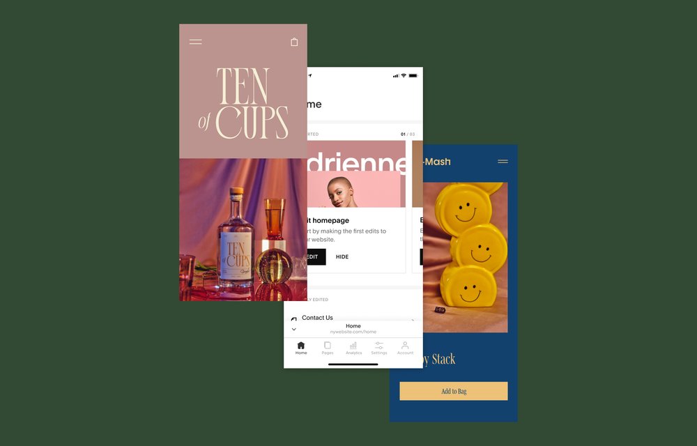
1. Online store
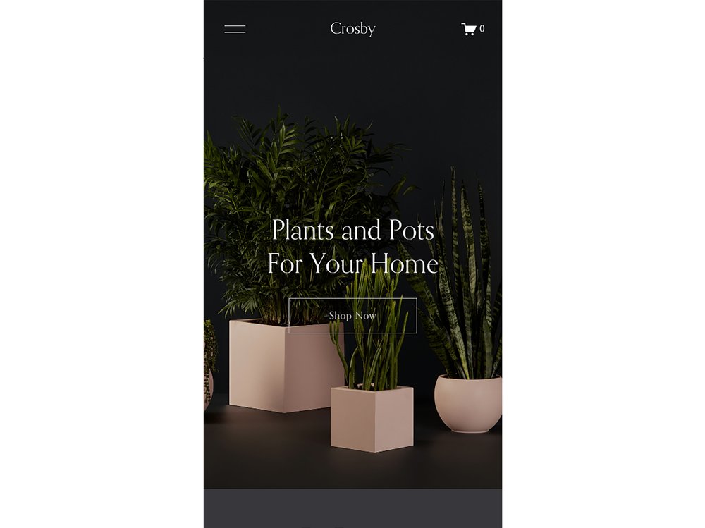
The goal of this ecommerce site is to get you to buy from the store. The mobile design highlights the two things you need to see right away: the products on offer and a CTA button leading to the full store.
You can also access your cart and the full site navigation, making it easy to find what you need.
2. Photography portfolio

Maybe the goal is to show off your art to build your reputation, attract clients, or both. The Reseda website’s mobile view draws your attention to the brand name and a featured image. Ideally that image is the work you’d be proudest of or that best represents your aesthetic.
Scrolling further tells you more about the photographer behind the lens and reveals more portfolio collections. The design is never overwhelming and still gives the photos space to shine.
3. Project-based services

If you’re selling your professional services, the most important things for potential clients are your expertise and your service options. With just two sentences, this mobile website tells you everything you need to know about what this business does and the specialty it focuses on.
A quick scroll gives you a preview of the design style, the designer’s experience, and testimonials. The design creates clear, easy-to-navigate sections and CTAs are clearly labeled so you know where links and buttons will take you.
4. Online course
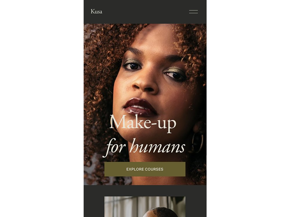
Similar to the online shop above, the mobile website for this online course makes sure visitors immediately see the information they need: what the online course covers and a link to see their learning options.
The course page itself resizes for the smaller screen, so it’s still easy to see the different lessons and descriptions.
Why mobile web design matters
Squarespace Analytics data will show you how many of your website's visitors are viewing on a mobile device. How well your website works in mobile view impacts how each of those mobile visitors views your brand—or if they discover it at all. A new visitor who finds your site on mobile might not return if it’s hard to use. And a lack of mobile-friendliness can hurt your search ranking.
Building audience relationships
How well your website functions—the user experience—is one of the main ways you can impact your relationship with your site visitors. Think of your website like an extension of you. If it’s hard to find information or use your website, someone is more likely to exit and not come back. As a result, they don’t get to know you and what you do.
The easier it is to navigate your site, the more likely people are to stick around and visit multiple pages, too. They might start by browsing your products, but if you guide them to your About Me page or a mailing list sign-up, that opens up more opportunities to earn a loyal supporter or customer.
Meeting your audience where they browse
Even though conversions are higher on desktop than on mobile, the majority of brand awareness and engagement occurs on mobile devices. What we can draw from that is that people look for products on their phones and then buy them at home or at work, when back at their desktop computers.
Creating a positive mobile experience makes someone more likely to come back to you when they have access to a laptop or desktop screen.
Increasing your SERP ranking
In many cases, the world’s biggest search engines, like Google, look at mobile versions of websites first—i.e., before desktop versions—when ranking them. This means that making sure your mobile site performs at least as well as, if not better than, your desktop interface is key to boosting your search engine results page (SERP) ranking.
This will help to boost your SEO beyond just well-produced, keyword-rich content—making sure as many potential customers discover your website as possible.
Still building your website? Learn how to design a landing page.
This post was updated on March 27, 2024.