Download a free workbook to help you design your site with confidence.
The email you entered is invalid.
Thank you for subscribing.
By entering your email, you indicate that you have read and understood our Privacy Policy and agree to receive marketing from Squarespace.
Low- and no-code website design software revolutionized the way individuals and businesses express themselves online. In the early 2000s, the earliest no-code web design tools, like Squarespace, promised users the ability to build a website without professional experience.
Websites soon went from cutting-edge marketing tools to a marketing and communications standard in most industries, and competition for internet users’ attention grew exponentially. Now, anyone building an online presence has high expectations of web design tools that can help them create beautiful websites that feel familiar enough to use, while offering something new, exciting, and engaging.
Squarespace, a leader in the no-code website design space since 2003, recently revamped its web design platform. Squarespace is now powered by Fluid Engine, available on Squarespace 7.1. Squarespace’s website design capabilities are now even more seamless making it easier for entrepreneurs to build a standout website that reflects their personal or brand vision.
In this post, we’ll cover the basics of no-code web design, its benefits, and the most important features for entrepreneurs to look out for when evaluating code free design tools.
What is no-code web design?
No-code website design allows individuals and organizations to build web pages using basic design principles and simplified visual layout tools instead of custom code, like HTML, CSS, or other common programming languages. Low-code development platforms offer similar tools, with some areas where code is encouraged—but not the primary tool for design.
Who can benefit from no-code web design tools?
Almost anyone can benefit from a no- or low-code platform, but entrepreneurs and small businesses have the most to gain from investing in a no-code website. Coding takes time to learn, and entrepreneurs often don’t have the cash on hand to pay a professional developer for a basic web presence as they work to start their business.
Someone starting a freelance business, for example, can use a no-code website to set up a portfolio website with images and samples of past work. Many major no-code platforms like Squarespace also have ecommerce and scheduling products to make it easier for freelancers and small businesses to build an audience without hiring a developer to custom code these features in.
What are some challenges of no-code website design?
For so many web design teams back then, no-code websites that looked beautiful in previews didn’t translate to a beautiful result. This prompted teams to hack their way into making a custom website, or hiring a developer to custom code elements, making websites harder to scale.
All technology has limitations, but entrepreneurs designing a website for the first time can benefit from understanding a few concepts critical to no-code web design that doesn’t break. Understanding these fundamental functions can help people find tools that enable them to build the website of their dreams.
Still, despite the promise of no-code web design platforms, the intersection of technology and design often comes with unexpected surprises. In this post, we unpack the no-code features entrepreneurs need to align expectations of their website with reality.
1. Drag-and-drop designing
Drag-and-drop functions are particularly common among no code platforms. They allow website designers to bring page elements such as text and images directly into the page layout. This intuitive design experience makes drag-and-drop an appealing option for beginner website builders using a content management system (CMS) for the first time.
Drag-and-drop website editors often include a menu of content options, such as:
Text and columns
Images
Videos
Buttons
Custom forms
Spacing blocks
Many designers expect drag-and-drop tools to give them freedom to arrange website elements exactly how they want it to appear in the final published site– many CMS tools are even called “What You See Is What You Get” (WYSIWYG) design tools.
The reality of a website built with a drag-and-drop tool is more complicated than an easy user interface makes it seem. Drag-and-drop design tools often work within a rigid row and column system that isn't flexible enough for complex design needs, and limits where site elements can be moved.
Moving images and text around within an editor can be challenging. It can make the experience of trying to translate a creative vision online particularly frustrating, introducing a learning curve that's sometimes difficult to overcome.
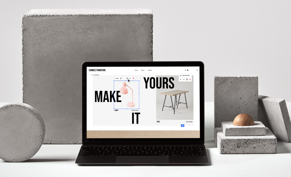
Web designers looking for a flexible no-code design tool should look for tools that include CSS grid functionality, like Squarespace’s Fluid Engine editor.
What is a grid layout?
CSS Grid Layout is a web editing tool that makes it easier for website designers without coding expertise to intuitively arrange web elements without the restrictive row and column system in traditional drag-and-drop tools.
Grid layouts make it easier for beginner web designers to customize their website designs with more responsive drag-and-drop capabilities. This leads to fewer surprises on a final, live site result. The ability to easily resize and align page elements on a grid allows for more flexibility in creating a professional look, without the need for code.
Those using grid layout tools can benefit by brushing up on the basics of visual and UX design to create an engaging website for their visitors. That includes:
Visual hierarchy: a design technique that lays out visual elements to make it easy for the eye to follow
Alignment: the way elements are arranged on the page to appear even and symmetrical
Whitespace: allowing enough blank space horizontally and vertically so pages don’t appear crowded
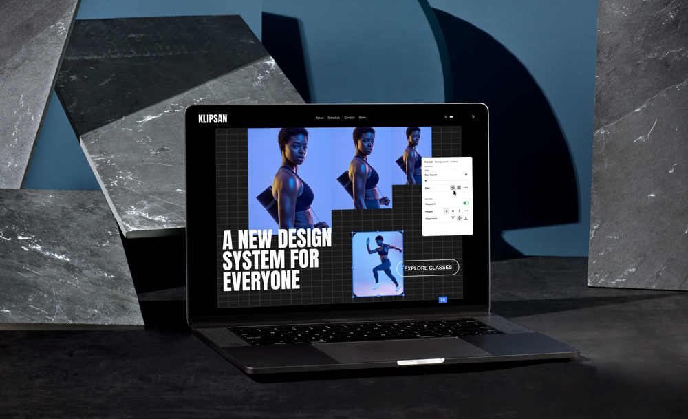
Squarespace's newest drag-and-drop editor, Fluid Engine, uses a flexible grid layout, which makes it easy for anyone to drag, drop, and arrange page elements to create unique website designs without compromising on usability.
These design techniques paired with tools like Fluid Engine will enable new web designers to create unique, beautiful, and functional websites to showcase their idea or business.
2. Mobile-responsive design
No-code web designers face the challenge of creating websites that are beautiful and functional on desktop and mobile devices. Almost anyone who has used a drag-and-drop design tool for websites, apps, or emails has likely experienced the frustration of creating a beautiful desktop website that doesn’t quite translate to a mobile view.
The last thing any entrepreneur or creator wants is a beautiful website layout and design that shifts or breaks as soon as someone views it on mobile. Some issues make it harder for site visitors to reach information and take action, which increases a website’s bounce rate. Those issues include: cut-off visuals, inconsistent spacing, word breaks, or hyper-extended page length.
What is mobile-responsive design?
Mobile-responsive design is website design that accounts for different layout dimensions and speed capabilities on mobile devices.
Unlike mobile apps, which are designed to be native to mobile devices, mobile-responsive website design adjusts a web page to be easier for mobile searchers to use it.
Some examples of how websites respond to changes in mobile layout include:
Condensing or removing blocks of text from mobile view
Changing image settings to automatically adjust with the size of the web browser
Most no-code website tools are equipped to create mobile-responsive websites.
Why is mobile-responsive design important?
Most people browse the internet using their mobile devices: over half of total website traffic comes from mobile. Mobile-responsive design creates a consistent and high-quality visual experience for website visitors by:
Providing consistent brand representation for desktop and mobile users
Surfacing relevant information in more visible places
With the majority of search engine queries happening on mobile devices, web designers looking for low- or no-code platforms should consider tools that make it easy to create a beautiful website that works just as smoothly when viewed on smartphones as tablets. Popular search engines also prioritize mobile website experience in their ranking algorithms, known as mobile-first indexing.
Website creators and entrepreneurs should consider investing in no-code solutions that are set up for seamless, automatic transitions from desktop to mobile. This will help potential customers and clients find what they’re looking for, and improve the brand’s organic search visibility in the long-term.
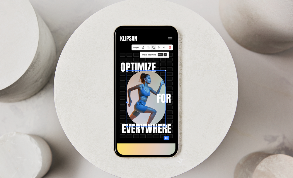
Fluid Engine makes it easy to create a beautiful website experience for desktop and mobile. Its preview and editing tools allow users to toggle between mobile and desktop previews, and make easy edits on both views. Web designers can also edit the mobile and desktop experiences independently of one another, and no longer have to sacrifice their desktop design for a better mobile experience. This means when the time comes to publish the website, there won’t be any surprises on the website’s mobile experience.
3. Pre-made functions and features
No-code web design tools give users the ability to creatively express themselves or their brand down to precise design choices such as fonts, colors, and shapes. Some, however, might feel limited by no-code tools’ pre-made site functions that don’t easily reflect their creative vision.
No-code website builders often come with ready-made page or section templates that make for quick and easy website setup, but templates might feel too limiting for creators and entrepreneurs looking to set their brand apart. An entrepreneur opening a new yoga studio in a competitive market, for example, will want to keep the familiar usability of other boutique fitness studio sites, but also flex their own unique brand voice with custom colors, shapes, or animated gifs of poses attendees can expect from a class.
Fluid Engine puts creativity first, allowing entrepreneurs building a new website to incorporate and customize features like menus, social media feeds, and even graphs to tell a specific brand or product story.
Websites need more than templatized layouts to create engaging experiences online. Some website building solutions, like Squarespace, offer the ability to customize certain pre-built features, such as:
Scrolling blocks
Navigation bar effects
Accordion blocks
Image shapes
Button styles
A freelance SEO consultant, for example, can illustrate the value of their services by combining Fluid Engine pre-built features like custom line graphs to show organic search traffic growth or logos and testimonials from satisfied clients. With Fluid Engine, entrepreneurs in any industry can express their creativity and tell their brand’s unique story– all without leaving Squarespace.
Website owners can use these tools to express their brand’s unique personality and stand out from competitor sites.
Designing a great website on a no-code platform shouldn’t be a guessing game. Web designers should feel empowered to create and explore different ways to make their websites unique, without worrying about whether the final product lives up to their vision.