The founder of the website company created an office focused on employee needs and company values.
Forget about perks. The founder and CEO of Squarespace says he believes that the right office design is the key to a productive workplace.
From my first step into Squarespace’s new headquarters in Manhattan's West Village, it was clear what Anthony Casalena and his team are all about. While other tech companies focus on perks such as gourmet food and massages, Squarespace’s New York headquarters reflects the company’s core values of simplicity and elegance. It’s no surprise that the company’s motto is “Make It Beautiful.”
“We appreciate aesthetics, we appreciate design, we appreciate minimalism and we hang out and have conversations in these adult places,” Casalena tells Entrepreneur. “We wanted to keep some aspect of that cultural value in the fundamentals of the space.”
The Squarespace headquarters is located on four floors (five if you include the rooftop) of New York’s historic Maltz Building, which once served as a manufacturing hub in the city’s Printing District. To achieve his vision, Casalena partnered with architecture firm A+I, whose clients include Tumblr, HBO and Viacom.
Working with lead architects Brad Zizmor and Dag Folger, the team spent more than 13 months thinking about and executing the designs for Squarespace's offices in Portland, Ore., Dublin, Ireland and New York. The architects held one-on-one meetings with employees, hosted group research sessions and workshops, conducted digital surveys and spent hours observing workers to uncover what the teams wanted in their work environments.
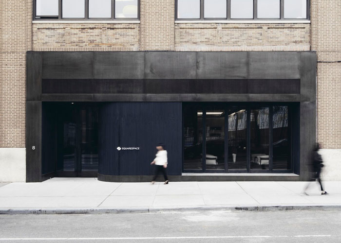
The black entrance of Squarespace's New York office looks simple, yet it is meticulously detailed. A lack of vivid color on the outer entryway symbolizes the elegance and effortlessness that the company strives to convey with its product. There is only one small sign reading “Squarespace” on the entire premises -- Casalena wanted the design to speak for itself.
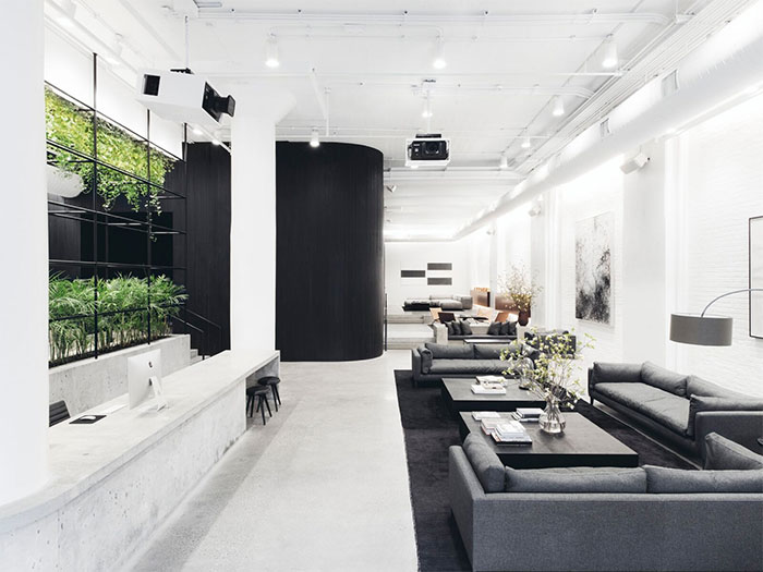
The expansive lobby is minimalistic, which promotes productivity. High ceilings, polished concrete floors, natural light and rows of various types of seating fill the space. It’s a place for visitors and employees to meet, and it doubles as an event hall and an area for independent work or waiting. The space features a number of products from Squarespace customers.
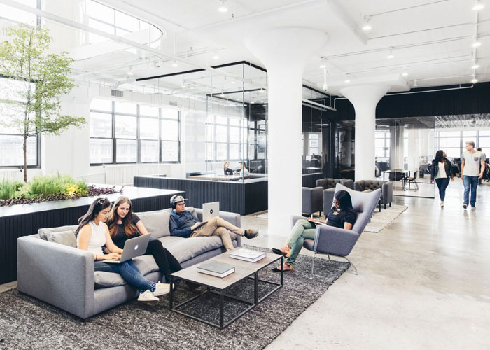
Given that the majority of Squarespace’s employees are engineers and designers, it was critical to incorporate a variety of spaces where they could easily transition between individual and collaborative work. As you walk through the space, you might see two people meeting for coffee on a couch in the atrium, a group of people collaborating at a row of desks in the back corner or someone on a private phone call at the communal bar.
As you continue to make your way through the spacious environment, you will see staggered rows of concrete desks along the perimeter of the floorplan. Hundreds of employees seated at them overlook gorgeous views of New York. Like many tech offices, the space is open. The lighting and furnishings accentuate the Squarespace palette of black and white, adding texture and warmth while maintaining a clear sense of organization.
The center of the space features various common areas such as glass-enclosed rooms, couches and grouped desks. “By having so many diverse and varied work environments, I think it helps you restart your thinking during the day,” Casalena says. “It’s why people go and work in a coffee shop.”
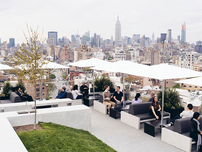
It also allows for easier collaboration. “I can go to the roof deck or walk around and bump into people and just sit down on the couch and have an impromptu meeting,” says Squarespace PR and Communications Associate Director Terry Wei.
Besides fostering the fluidity to easily pivot between individual and group work, Casalena and the team were committed to creating a space that is reflective of the company -- where creativity, comfort and collegiality could coexist.
“It’s the people moving in the space, it’s the ideas in the space, it’s living in the space,” says A+I architect Brad Zizmor.
Just as Squarespace websites are framed to show off clients' products, the company and Casalena hoped to express simplicity, minimalism and elegance through the space and highlight the “products” within the office -- the employees and their ideas.


