Download a free workbook to help you design your site with confidence.
The email you entered is invalid.
Thank you for subscribing.
By entering your email, you indicate that you have read and understood our Privacy Policy and agree to receive marketing from Squarespace.
Want to create web pages that are both beautiful and prompt action? A well-designed layout will keep users engaged and guide them toward your goals—whether that’s visitors making a purchase, signing up for a newsletter, or simply learning more about your or your business.
Below, we’ll guide you through the essential principles to create the most engaging web page layouts, from common layout patterns and examples to tried-and-true visual design guidelines.
What goes into a great website layout?
Think of a website page layout like a physical store. Customers expect to find certain things in specific places. Similarly, you can use familiar design patterns to guide website visitors and make them feel comfortable navigating your pages.
This means that you don’t have to reinvent the wheel. You just need to start with a basic structure, then focus on adding your personal touches to highlight your brand and offering.
Every page layout includes the following:
Core elements
Visual hierarchy
Design flow
Whitespace balance
We’ll look at each of these major components individually.
See site design advice from a Squarespace designer
Core elements
Every web page layout needs the following core elements to satisfy what visitors expect to see when they land on your site.
Navigation: Users need to be able to navigate your site intuitively. This is an important consideration on every page. Your menu (often part of the header) and links should offer an easy way for people to access different parts of your website. It often includes your logo, main page navigation, and a call-to-action (CTA) button.
Header/hero section: Your website header is the top section of your page. This includes some content and visuals that show off your brand and what you do. It typically hosts your navigation, a headline, a brief description of the page, a visual (image or graphic), and a call-to-action.
Content area: Here’s where you include the detailed information your visitors can dive into. Your written content, images, and other key elements (videos, CTAs, forms) are found in the content section of your page. This can include content like product features and benefits, client process, or history, about, and testimonials for your business, and more.
Sidebar: This vertical column, usually on the right or left side of a page, highlights extra information people might find useful, such as Contact, Business Hours, or Related Pages links.
Footer: At the bottom of your page is the footer, which may contain page links, contact details, social media links, and a newsletter sign-up form, plus copyright and privacy policy information.
Don't underestimate the power of predictability. When visitors encounter familiar website layouts, they can focus on your content and message instead of struggling to find their way around.
Visual hierarchy
Visual hierarchy guides your visitors through your page, leading them to the most important information first. This ensures they see your key messages and encourages them to engage with your content.
To create an effective visual hierarchy, use design elements like:
Color: Use contrasting colors to highlight key elements.
Font styles and sizes: Use larger, bolder fonts for important headings and smaller fonts for body text.
Element placement: Position the most important elements higher on the page.
Ask yourself: "When I land on this page (or section), what do I see first?" This helps you understand how visitors naturally scan your content.
A typical visual hierarchy might look like this:
Headline text
Image/graphic
Body text
Call to action (CTA)
Design flow
When reading web pages, people tend to scan content in predictable patterns. Two common patterns are the F-pattern and the Z-pattern. Understanding these patterns can help you design more engaging layouts.
F-pattern:
Readers focus primarily on the top and left sections of the page.
The first few lines of text and the first few words on each line receive the most attention.
Ensure your most important content is at the top and left of the page.
Z-pattern:
Readers scan across the top of the page, then diagonally down to the bottom left, and finally across the bottom.
Use the top and bottom of the page to capture attention and convey key messages.
By considering scan patterns, you can strategically position elements to capture the attention of a wider audience. Keep in mind that patterns can differ depending on where your audience lives—visitors who use languages that read from right to left, for example, might scan pages differently.
Whitespace balance
Whitespace, or negative space, is exactly that—empty space between text and visuals on a web page. You may not think about whitespace too much until you land on a site that’s so cluttered it’s hard to find anything. Whitespace matters. It separates key elements, creating a comfortable buffer between sections.
Use whitespace to create a clean, crisp look and improve your page’s readability. That whitespace also helps you create the design flow mentioned above and highlight important details for your visitors.
3 website layout examples
1. Kearny
This site for a community studio space makes good use of a featured image or hero section that creates an emotional response, placing important details using an F-pattern.
2. Forma
A balanced design with a strong header. This layout works well for navigation ease and content-focused pages, loosely following a Z-pattern in each page section.
3. Spotted
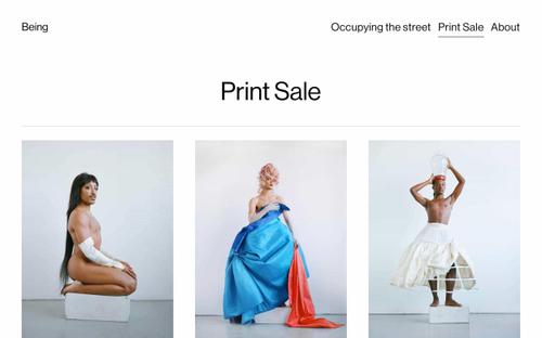
The grid-style layout below the hero of this website presents good contrast and navigation ease.
6 common layout patterns
Try out these popular layout patterns to discover visitor-friendly, effective ways to structure your web pages. You may find that different layouts work better for different pages or page sections on your site.
Single column: The single-column layout is all about simplicity. Since all the content is organized in a single vertical column, it works well for content-focused pages, especially blogs. Its use of whitespace allows important content to be prioritized in relation to other content on the page.
Two columns: This website layout pattern is very versatile. It allows you to create a balanced and visually appealing design by combining text, images, and other elements in a variety of ways.
Multi-column (grid): For website designers who want to include a variety of elements on each page, a grid layout pattern maximizes flexibility while providing structure. You can add or subtract columns as needed to achieve just the look you’re going for.
Featured image/hero section: Large visuals capture attention. You can convey a lot of information while evoking a strong emotional response with a carefully chosen featured image. Hero section layouts set the tone of your page, and are usually followed by another layout pattern.
Split screen: When you want to present different options side-by-side to contrast information, a split screen layout pattern is an effective choice. It also works well for calls to action, where you can present pertinent information on one side and a CTA button on the other side.
Asymmetrical: This style varies sizes and weights to create visual interest and contrast. For instance, a bold, oversized image paired with a delicate, minimalist font, or a cluster of elements intentionally placed off-center. It’s a good choice for someone who wants to add more artistry, trendiness, or playfulness to a site.
Tips for choosing the right layout
Which website layout pattern is right for you? Follow these steps to determine the right layout for a page.
Page purpose: What’s the purpose of the page? Are you selling products? Showcasing a portfolio? Providing information? Your layout design should help visitors identify the primary goal of your page.
Define page type: Consider the page type (blog, portfolio, service or product offering, info page, etc.). What’s going on the page will guide you toward a layout pattern that displays it best.
Test variations: Before finalizing your decision and publishing your page, try two or three different website layout ideas to see which layout pattern conveys your message most effectively.
For example, the purpose of a Services page is to share details about the services you offer and convince someone to become a client or customer. The page might be laid out in a single column with these elements:
Hero: Full-width image with text and a CTA button
Summary section: A large text section explaining the services you offer
Features and benefits: Highlight three core benefits with three columns of content
Process section: A high-level overview of steps in your process, as a carousel
Pricing: Outlining the pricing and what you’ll deliver
Testimonials: A slider showing off positive testimonials
Final CTA: Full-width image with text and a CTA button
Whether you’re new to layout design or you’re a pro at it, you can also get automatic suggestions for layouts on Squarespace. The Layout Switcher tool enables you to see different layout options and apply them quickly before you publish a page.
Best practices for visual design
Whatever website layout pattern you decide to go with, these best practices will help you come up with a winning visual design.
Balance: Any page you create needs to be visually balanced. Too many elements too close together create disharmony. Balance can be achieved through symmetry (mirrored effect), asymmetry (dynamic look), or radial balance, which draws attention to a focal point.
Contrast: Create contrast to improve readability. Follow best practices in typography, colors, font sizes, and font styles to create pages that are relaxing to the eye and easy to read.
Repetition: It’s perfectly fine to repeat design elements as long as you’re doing it in a way that creates consistency and a cohesive look. Some of the elements you can repeat are color usage, font styles, spacing, and section layouts.
Alignment: Use a grid to align your page elements. This will create a clean, organized appearance.
Proximity: By grouping related page elements together, you can improve both page organization and readability.
Using a grid to support layout decisions
A grid can be useful for pretty much any website layout design. It enables you to experiment with different element placements while providing you with a framework to do so.
Using a grid, you can play around with these basics:
Columns: They create separations across the width of your page. Avoid columns running into each other; use whitespace for clarity.
Rows: They separate your page horizontally. Create the right amount of spacing between rows.
Gutters: They separate content between columns and rows.
Choose a layout pattern that best suits your content and goals and don't be afraid to experiment with different layouts to find the perfect balance and visual appeal for your website. By applying these best practices, you can confidently create the most effective page layouts for your website.


